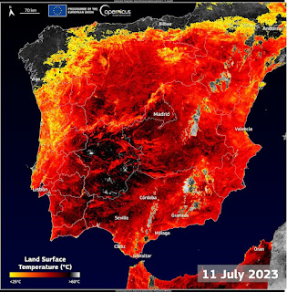
Land Surface Temperature (LST) is a crucial metric in the discourse on global warming and climate change. However, LST is often taken out of context, leading to confusion and misinterpretation. Recently, the BBC reported on the Cerberus heat wave that swept across several European cities, and their report had an LST map from the Copernicus Sentinel imager.
The map, with its ominous red hues, had Spain looking like Hades and folks on Twitter, quickly jumped on it offering different hot take on the matter. Twitter is a space where climate experts, deniers, believers, and non-experts alike congregate to discuss climate-related issues. Personal opinion abounds. Be warned!
While maps are useful in visualizing data, they can also be misleading when taken out of context. For temperature maps, blue is typically associated with cooler temperatures, while red signifies hot or extreme temperatures. However, in reality, the electromagnetic spectrum has blue as a hotter color than red. (Little matter). Not to add to the fuel, I have included the notorious map at the end.
The Copernicus LST map was quickly taken out of context, leading to misconceptions about the nature of LST and how it relates to air temperature. It is crucial to note that LST is not air temperature, which is typically how we report high or low outdoor temperature. When people check their phones and see 23 C, that is air temperature and not land surface temperature. Additionally, extreme heat events like Cerberus rely on other weather anomalies to build a robust profile of what is happening. Therefore, high humidity and high pressure, compounding unusual air temperature, can result in extreme heat.
In contrast, air temperature is measured with thermometers that are shaded from direct sunlight at a height of 1.5m or 2m to minimize the impact of LST and cold drainage effects. LST is typically derived from satellite readings of emissivity, brightness temperature, and additional computations to find land surface temperature.
TC Chakraborty of the Pacific Northwest National Laboratory, WA. has a good thread where he stiches some of the complex temperature narratives together. https://twitter.com/TC_Chakraborty
To better understand the complexities of temperature measurement and interpretation, it is thus crucial to contextualize temperature data and consider multiple factors when interpreting extreme weather like Cerberus.
If, you are of the chat GPT subset poem persuasion, I got Poe to address those concerns by summarizing TC tweet in a verse form.
A temperature gap of ten degrees,
Between city and rural, so it seems.
But don't be misled, let's contextualize,
To understand the truth behind the guise.
Satellite-based, it's a complex field,
Factors abound that must be revealed.
Urbanization, land use, and more,
All play a role in the temperature score.
Climate change is a timely concern,
As the UK's record-breaking turn,
Reminds us to consider the heat,
And the implications it will meet.
In summary, let's not jump to conclusions,
But study the data with care and deliberation.
For when it comes to land surface temperature,
There's much more to it than just the measure.

Comments
Post a Comment